
Visual Assets, Usage and Policies
The Wesleyan University Visual Guidelines were developed with one goal in mind: to create a shared visual identity that reflects the excellence of this great university. The resulting system presents Wesleyan as a world-class university that builds on the strengths of its many parts to make the whole even stronger.
Neither the wordmark, monogram nor the academic seal should be re-proportioned, redrawn or modified in any way. They should never be scanned or reproduced from pervious materials and should not be downloaded from unauthorized areas on the web as this process reduces overall reproduction quality and visual style consistency.
VISUAL ASSET USAGE GUIDELINES
These guidelines are meant to facilitate best practices, to help the Wesleyan community present their communications in a way that reflects positively on the university, and to provide answers to common visual and design questions.
The Office of Communications is responsible for creating and maintaining the University's visual identity system and is available to respond to inquiries regarding its use.
For Faculty, Staff and Students
Faculty, staff and students should follow the visual identity guidelines when using the university marks for reports, presentations, promotional items or other uses. The approved wordmark and cardinal mark, in several formats, is downloadable from the Templates and Files section of the Visual Guide.
For Individuals External to the University
This guide is intended for use by the on-campus Wesleyan community and by external designers and other vendors performing work on behalf of the university. Any individual, groups or companies external to the university wishing further information about the logo and seal should contact ucomm@wesleyan.edu.
Maintaining Integrity
All of the Wesleyan University marks should be rendered with utmost respect, and reproduced with consistency and integrity. It is essential that the university marks and graphics are always used according to the "proper use" specifications listed.
Do Not:
|
|
|
|
|
|
|
|
|
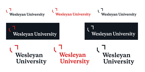
MASTER WORDMARKS
Specifications
Minimum Sizing
1.25 inches wide for print; 150 pixels wide for web
Minimum Spacing
When pairing with other components, always refer to the height of the open shield to act as a space buffer around the mark. For tighter layouts, the buffer can be reduced by half.
Proper Uses
The wordmark has been set with particular letterspacing and should not be recreated by simply typing it out. When used as a logo, the official vector artwork should be used.
All versions of the Wesleyan wordmark should be displayed prominently and clearly to maximize impact. It is important to both display the wordmark with a clear space area around all four sides and adhere to the recommended color combinations in order to maintain brand consistency and integrity.
The Wesleyan wordmark is a federally registered trademark. We did this to ensure the high quality consistent standard that is associated with Wesleyan University.
The wordmark comes in a single line (horizontal) and stacked (vertical) configuration with the primary mark being the single line wordmark. In instances where space is limited the stacked (vertical) mark can be used. All rules still apply.
To download the wordmark file, go to our Templates and Files webpage.
WORDMARK LOCK-UP SAMPLES

Specifications
Minimum Sizing
1.25 inches wide for print; 150 pixels wide for web
Minimum Spacing
When pairing with other components, always refer to the height of the open shield to act as a space buffer around the mark. For tighter layouts, the buffer can be reduced by half.
Proper Uses
A lock-up is the intentional arrangement of the master wordmark and its accompanying elements. It is a fixed relationship between the master wordmark and another name that should not be changed. Lock-ups are for departments, centers, schools, programs, offices, and other official Wesleyan-related entities.
All versions of the wordmark lock-up should be displayed prominently and clearly to maximize impact. It is important to both display the lock-up with a clear space area around all four sides and adhere to the recommended color combinations in order to maintain brand consistency and integrity.
To acquire your department or program's wordmark lock-up, please contact ucomm@wesleyan.edu .
MONOGRAM

Specifications
Minimum Sizing
.5 inches wide for print; 40 pixels wide for web
Minimum Spacing
When pairing with other components, always refer to the height of the monogram down to the top of the "W" as a guide to measure a space buffer around the mark. For tighter layouts, the buffer can be reduced by half.
Proper Uses
Our monogram is shorthand for the master wordmark and can be used in its place when working with internal audiences. For external use, the monogram should be accompanied by the master wordmark or exist in the context of Wesleyan already.
ACADEMIC SEAL

Specifications
Minimum Sizing
1 inch wide for print; 90 pixels wide for web
Minimum Spacing
When pairing with other components, always refer to the width of half the inner shield shape. For tighter layouts, the buffer can be reduced by half.
Proper Uses
The academic seal is strictly reserved for academic or official University purposes. Always check with University Communications on proper seal usage. The official Wesleyan University seal is used on formal documents, i.e., diplomas or other official administrative communications emanating from the President's Office or the Board of Trustees The seal is also used for official ceremonial functions such as Commencement and appears on approved plaques, flags or furniture.
The seal is not the school logo. It should not be used on general stationary merchandise, or brochures as a logo. It is reserved for official and ceremonial functions, and for items generated by the president's office for special purposes.
To request use of the academic seal, please contact ucomm@wesleyan.edu
ATHLETICS CARDINAL + W MARK

Specifications
Minimum Sizing
1 inch wide for print; 72 pixels wide for web
Minimum Spacing
When used in conjunction with other graphic elements, the cardinal + W mark must maintain a negative space of AT LEAST 25% of its height surrounding it at all times. This will prevent crowding and ensure that the integrity of the mark is protected.
Proper Uses
This mark is for shorthand use within the Athletics Department. The cardinal + W graphic has been created combining the Wesleyan W (based off of master style typeface Copernicus) with the cardinal mark. Only Wesleyan Athletics can use this mark.
Alternate color and outline versions have been created to ensure that the cardinal + W can work on any approved background.
For the complete guide on athletic mark use and specifications, please contact ucomm@wesleyan.edu
CARDINAL MARK

Specifications
Minimum Sizing
.5 inch wide for print; 40 pixels wide for web
Minimum Spacing
When used in conjunction with other graphic elements, the cardinal mark must maintain a negative space of AT LEAST 25% of its height surrounding it at all times. This will prevent crowding and ensure that the integrity of the mark is protected.
Proper Uses
The spirit mark is an additional image associated with Wesleyan and may be used in collateral and on merchandise as a design element, but not in place of the wordmark.
The spirit mark was generated specifically for promotional uses such as on clothing and merchandise. It also may be used on informal and disposable items such as napkins, coasters, cups and notepads.
The spirit mark can be used for any collateral designed for prospective students, students (athletes and non-athletes), alumni, parents, faculty and staff.
Note: The Cardinal graphic should always be used facing to the right, and never facing left.
OPEN SHIELD


Proper Uses
The open shield is to be used sparingly, as a graphic element to highlight subjects in photography and to highlight messaging. The open shield graphic cannot be adjusted to fit into images. Images that can be easily highlighted by the open shield will be selected.
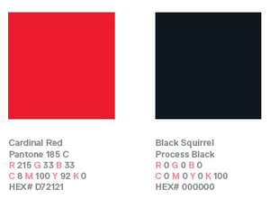
COLOR PALETTE
TYPOGRAPHY
Our type family consists of two typefaces. Copernicus, our serif typeface, is used in our master wordmark and as body copy in print and on the website. It may also be used in bolder applications when working on more expressive materials such as posters and flyers. Replica, our sans serif typeface, is used for web headers, for print headlines, and call-out treatments.
For more on Wesleyan's fonts and font types please visit our Typography Style Guide.
NOTE: In the event where usage of Copernicus and Replica aren't available, Georgia can be substituted for Copernicus and Helvetica or Arial can be substituted for Replica.